

The phenomenon of branding and logo design started to promote the identification of products. The Best American Website Designer learns from the pages of history to develop an outstanding team for illustration services. The concept of logos has been around for millennia, with one of the earliest forms of what could be considered a logo appearing in ancient Egypt.
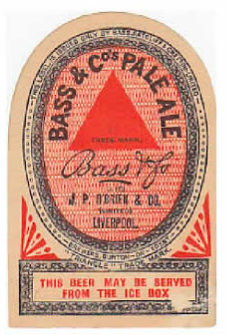
These early logos were used to identify ownership or origin, much like logos today. One of the earliest uses of pictographs and symbols to represent the identity of a pharaoh or a deity. However, if we are talking about the first modern logo in the context of branding and trade identity, the Bass Brewery logo, designed in 1876, is often credited as one of the first. The logo, a simple red triangle, was registered under the UK’s Trade Mark Registration Act of 1875, one of the earliest registered trademarks in history. However, the first logo was from the United States of America in 1870 – Averill Paint logo.
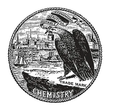
Averill Paint (1870)
After Egyptian historical symbols of identification belonging or trademark stamps. The first registered logo came out in 1870 as Averill featured an eagle illustration holding a paint bucket with a brush in its beak. There were some words as well to elaborate on the details about branding. It was the beginning of illustration services & logo design.
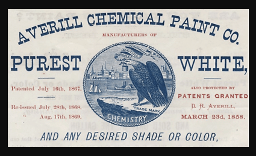
These written words “Durable, Beautiful, Economical” in a flying banner. This trademark predates the Bass Brewery logo and reflects the early use of logos for branding and marketing purposes. So, we can assume that that was the very first logo to enter the market with some particular brand. In Europe, the Bass Brewery logo was the very first logo at that time; communication wasn’t that strong. So, people were unaware of Bass Brewery in America even in 1875.
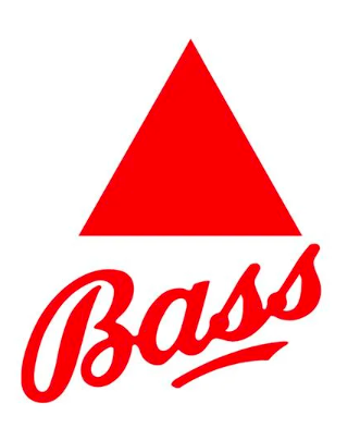
Bass Brewery (1876)
Right after Five years of Averill’s trademark, Bass Brewery (beer product) registered its famous red triangle logo in the UK under the Trade Mark Registration Act of 1875. However, that was the beginning of copyrights and registered trademarks. So, this act was one of the first pieces to protect trademarks, the beginning of modern trademark law in Europe.
Although the Bass red triangle logo is striking for its simplicity and durable design. Considered as one of the first modern logos and has been recognized in various forms of art. This also includes inspirational paintings by Édouard Manet and Pablo Picasso. So, the logo’s need and use are still present, and the purpose remains the same: To provide long-lasting identification like Coca-Cola and brand identities from history.
The Color Psychology
Let’s come to recent requirements and upgraded demands of marketing services. Start with exploring What is Color Psychology? Different colors can induce different emotions and associations. Furthermore, that can significantly impact how a brand is perceived by the customers. Color psychology is the study of how colors affect people’s perceptions and behaviors. That becomes obligatory in marketing and branding to launch or relaunch any brand. Understand how colors can impact consumers’ behavioral intentions toward a brand and influence their purchasing decisions. For example, Coca-Cola’s red branding induces feelings of happiness, energy, and excitement. These feelings are already associated with the brand niche and industry.
Some other colors can also have emotional implications in logo design:
| Purple | Royalty, wisdom, compassion, and creativity |
| Pink | Optimistic, innovative, creative, and childish/feminine |
| Black | Power, modern, sophistication, and strong |
| Gray | Neutral, calm, wise, and professional |
| Brown | Natural, stable, friendly, and comfortable |
| White | Sophisticated, elegant, and impactful |
Modern Trends of Logo Services
Branding and Logo Design becomes compulsory to identify your brand in the 21st century. There are lots of brands with strong identification and goodwill, while there are so many new entrants every day. However, it is a powerful iconic tool that can influence perception, trigger emotions, and drive consumer behavior. Understanding color psychology is crucial for creating a brand identity with remarkable impact. That also significantly influences your right target audience. We will further explore the importance of color psychology in branding and logo design. A professional logo agency like Best American Website Designer can help you adjust this knowledge to your advantage.
The Effect of Colors on Branding
We have already learned about the importance of color and its obligations to the brand identity. Let’s go deeper to explore brand recognition and loyalty attachment with logo colors. The colors of a logo can convey messages, set the tone, and distinguish a brand from its competitors. For instance, the color red can evoke pleasure and urgency. This also provokes popular choices for brands like Coca-Cola, KFC, and YouTube. Besides that, Blue is a sign of trust and professionalism. Therefore, the blue color is used by financial institutions and tech companies like Chase and IBM.
Identify Brand Personality
Every brand has a personality because it signifies some emotional attachment to the consumer. For example, a car represents luxury and comfort, which is defined through smooth and coefficient logo design. Every fast food or restaurant attaches to taste and quickly goes through the craving. Anyhow, before selecting colors, it is essential to define your brand personality. Are you a fun and energetic brand, or do you aim to convey reliability and professionalism? Your brand’s personality should align with the emotions and associations of the colors you choose. Imagine you have a food spot, and you represent a royal blue color logo or theme with it? That becomes ridiculous even in imagination.
Identify Target Audience
It is most important to identify your target audience first and understand them with reliability. Demographics are unique in behavior, so different influences of colors may respond differently. Consider the color preferences with a sharp mind to execute the right color combination. For instance, green has an association with health and nature in Western cultures. On the other hand, it can signify luck and prosperity in some Asian cultures. Always compile things with historical research and align your project logo design with the proper colors to target the audience.
Research & Analyze Competitors
Research your competitors’ color schemes and examine the maximum approach. However, it is also essential to distinguish differences from competitor themes. Understanding industry norms can provide valuable insights. Your first aim should be to stand out while still aligning with consumer expectations in your targeted demographics. Therefore, first, analyze your demographics and analyze your competitors extensively. Afterward, start scratching some pins on your logo design and color combination.
Expertise in Color Theory
Expertise like Best American Website Designer can bring in-depth knowledge of color theory and its application in branding. Our illustration services are outclassing with customization fulfillment according to client needs. We know an extraordinary award-winning team of designers who can initiate your requirements within no time. They can proudly help you select a color palette that also effectively connects your brand message. However, we know every brand is unique, and Best American Website Designer can offer solutions. It is our duty to help you out by matching your goals and initiating the reflection of your brand identity. We can also create a custom color palette that sets your brand apart.
Some Strong Case Studies
McDonald’s: They have initiated the red and yellow colors to represent excitement, fun, happiness, and craving. These two colors can trigger the feelings of consumers for long-lasting loyalty. Red and Yellow colors are effective in inspiring appetite and creating a sense of urgency. Therefore, every next entrant will also use them as a perfect combination for fast food.
Tiffany & Co.: The 18th-century luxurious jewelry company adopts the elegance of blue color that has the attachment to luxury and superiority. As they claim to have been working since 1837, their specific shade of Blue has become Tiffany blue as their identification. See how strongly they pitch themselves in color psychology attachment. They have become an iconic part of the brand’s identity with purity of elegance.
Spotify: The color psychology keeps on working forever. Let’s take the example of Spotify’s vibrant green to notify innovation, growth, and energetic influence. Now, we are talking about the 21st-century brand of the music industry. Revolutionizing the online streaming industry among the youth. Their green color creates enthusiasm and excitement appeal among the audience.
Conclusion
Color psychology is a serious feature of branding and logo design that can significantly impact the perception of customers. As a brand owner, you must understand the emotional and psychological effects of colors. Further, you can make informed decisions that improve your brand’s identity. You have the advantage of our illustration services, which you can trust to get expert guidance in selecting and implementing the right colors. Therefore, it is in our DNA to help your brand stand out in a competitive market. Invest in color psychology to create a compelling, memorable brand that resounds with your audience’s preferences.